Page 23 of 72
Posted: Mon 10. Oct 2016, 19:17
by Rachel McCollough
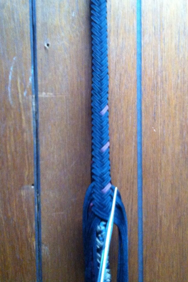
Not a great pic but you get the idea

Posted: Mon 10. Oct 2016, 19:23
by Jessie Edwards
Ooooooooo blue. I need to explore blue. I always go brown and black. Puuurty nice WS
Posted: Mon 10. Oct 2016, 19:23
by Ron May
Rachel, are those the colors for the overlay?
(I am seeing royal blue and lavender, which , by the way, I think would be a cool combination)
Ron
Posted: Mon 10. Oct 2016, 19:35
by Rachel McCollough
Black and burgundy, showing funny thanks to the great lighting in my house
Posted: Mon 10. Oct 2016, 19:37
by Rachel McCollough
Blue and lavender would be nice, Ron! Jessie yes you need some blue!
Posted: Mon 10. Oct 2016, 20:20
by Tyler Blake
Ok, I was gonna say- it looks blue and lavender for me too :P
Posted: Mon 10. Oct 2016, 21:20
by Robby Amper
Nope. Not, if you look at the vertical lines at Rachel's wall. On the other pics they're deep black.
Here they are blue. That means, that everything that appears blue must be black.
Rachel - this is not a problem of the light in your house. It's a problem, caused by the camera.
What it didn't do is called "White Balance". Those cameras are stupid like a hand full of salt.
You have to "tell" them what is white. When they "know" that, the have all the other colors
straight. I bet, the last pics you took, have been shot outside. That light is - for the camera -
totally blue. You take the next pic inside - no white... - everything is shifted to blue.
That's all
Robby
Posted: Mon 10. Oct 2016, 21:48
by Rachel McCollough
Ah, now I understand, Thank you very much for the explanation Robby!
Posted: Wed 12. Oct 2016, 00:28
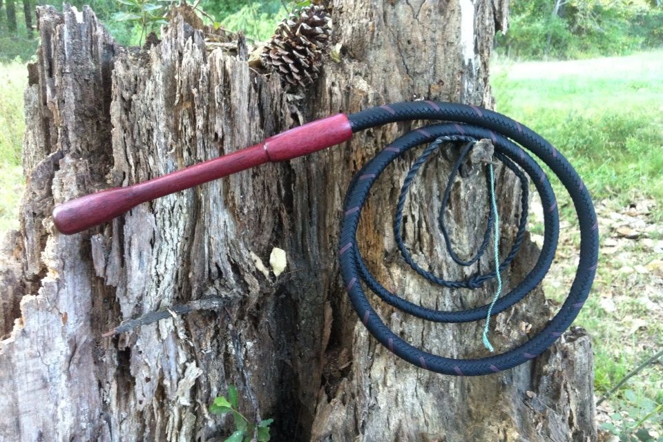
by Rachel McCollough
Done! Now I can play with it!
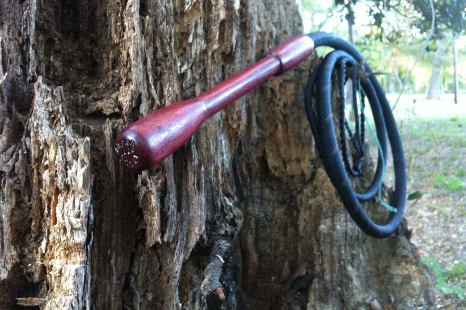
6' 16 plait Amper Style black & burgundy accent with two plaited bellies. English Eye Twist. 12 1/2" handcut Purpleheart handle.
Weighted Twisted Taper Fall, Dyneema cracker.
Black paracord and Purpleheart stock for handle from
www.whip-nation.myshopify.com
Posted: Wed 12. Oct 2016, 00:30
by Jessie Edwards
Oh beautiful Whippy Sistah...perfect
Posted: Wed 12. Oct 2016, 00:35
by Rachel McCollough
Thank you, Jessie! Now to work on that cracking skill

Posted: Wed 12. Oct 2016, 00:37
by Ron May
Rachel, absolutely you!
The burgundy accent and the purple heart go so well together.
I love the elongated barrel look of the cup.
This is so elegant and sleek that, I know that I have said this before about a previous whip but, this is the best whip you have ever made.
The look, the styling are......... (I ran out of superlatives)
See you in the 10/10 practice challenge, Jessie's WS.
Ron
Posted: Wed 12. Oct 2016, 00:39
by Ron May
That handle just says, "Hold me !".
Ron
Posted: Wed 12. Oct 2016, 00:52
by Rachel McCollough
Thank you, Ron!
The handle, I shortened up the angle grip some so it'd fit my narrow hands. It works
Posted: Wed 12. Oct 2016, 05:41
by Craig Frank
Looks great, Rachel. I'm glad that my recommendation worked out for you.
Posted: Wed 12. Oct 2016, 07:43
by Stefan Oberenzer
Oh wow. Very nice looking, elegant whip.
I love the little accent you have given with the burgundy cord.
Posted: Wed 12. Oct 2016, 10:24
by Rachel McCollough
Craig you did indeed name the colors, and I thank you, sir! It looks really sharp with the Purpleheart! Good eye, Craig!
Stefan, thank you!
As stated above which I did miss in the description of the whip, Craig was kind enough to suggest the burgundy, and I'm sure glad he did.
Posted: Wed 12. Oct 2016, 10:33
by Guest
Beautiful, simple elegance!
Posted: Wed 12. Oct 2016, 14:18
by Rachel McCollough
Erik, thank you
Posted: Wed 12. Oct 2016, 14:32
by Jessie Edwards
I know, right? There is a singular kind of beauty to simplicity. I love ornate. As a steampunk Victorian era lover, ornate is the thing. But I think my favorite pieces are the ones that are just present. Rachel's whips have a presence that just don't need fru fru to get noticed.


